What Makes Great SaaS UX Feel Effortless
August 24, 2026
10 mins


A landing page can make a fine promise. The product still has to keep it.
Picture a new customer opening an empty account and wondering what to do first. A manager hunting for one number before a meeting. Someone hitting an error and looking for a way out, not a vague apology.
When these moments work, people get on with their day. When they do not, the tool starts to feel like part of the problem.
Software as a service has made buying a business tool almost too easy. Keeping people around is the hard part.
A SaaS application has to make sense on day one, then stay useful once it becomes part of the weekly grind.
Semrush lists 28 million users, 28.8 billion tracked keywords, 808 million domain profiles, and 142 geo databases. That is not a measure of the SaaS market. It does, however, hint at the amount of research people do before choosing a product. The current numbers are on Semrush’s statistics page.
And that is why the experience cannot be reduced to one attractive screen. The administrator setting permissions, the team lead checking a report, and the specialist processing data all want different things from the same product.
Good design does not pretend their work is simple. It simply removes the friction that never needed to be there.
In plain terms, it is the work of making cloud software useful, clear, and dependable. The interface is part of that, but so are the onboarding process, navigation, search, loading states, permissions, support, and the route back when something goes wrong.
The ISO 9241-210 standard for human-centred design puts people, their context, and their needs at the centre of the process. That sounds obvious. Product work often drifts away from it.
Starting with “send the report” or “resolve the failed import” gives the team a real problem to solve. Starting with a feature list does not.
Traditional UX may deal with one main journey. A SaaS app has to survive Monday morning, month-end reporting, a new colleague, and new features arriving later. When designing for SaaS, repeat use matters as much as first impressions.
Great UX is not a one-time hand-off. If a product feels mentally tiring, our guide to reducing cognitive load in UX can help uncover the decisions piling up.
Across the SaaS space, user behavior usually tells a clearer story than a feature wish list.
Forget the visual style of the month for a moment. The useful question is simpler. Does the product respect people’s time?
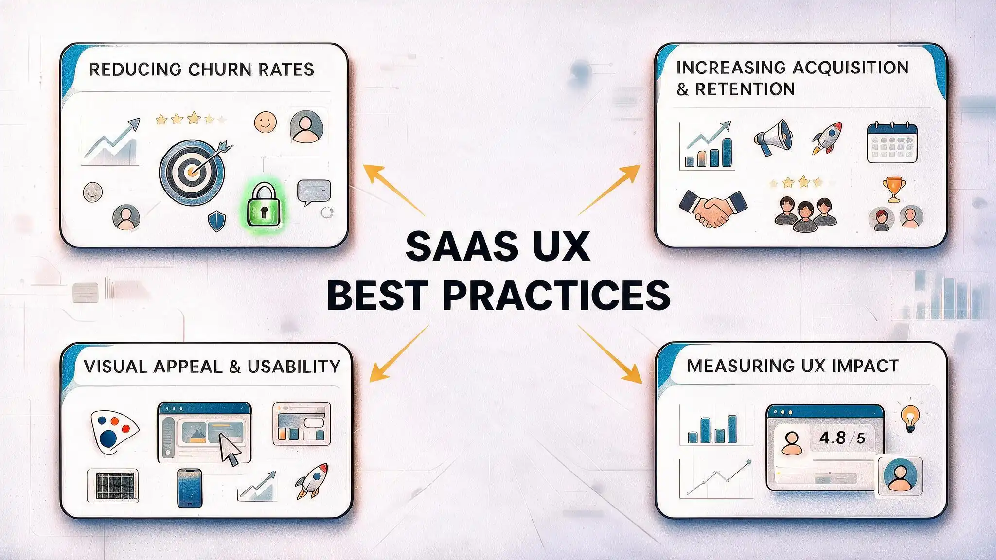
People rarely cancel because a button is the wrong shade of blue. They leave when a powerful SaaS product takes too long to become useful, or when using your SaaS product begins to feel like another job.
First, find the earliest moment when the product genuinely helps. An analytics tool might connect a data source and surface one useful insight. A project tool might help someone assign a task and get a response. The onboarding flow should guide users to that moment. It does not need to parade the product's full set of features past them first.
In practice, here is what that looks like.
NN/g’s research on onboarding tutorials and contextual help found that automatic walkthroughs are often skipped and can interrupt the task at hand.
Contextual help has better timing. It appears when someone has a reason to use it.
To reduce churn in SaaS, watch activation, time to first value, and completion of a key workflow. These numbers reveal whether the onboarding experience is getting people started or losing them quietly. Our guide on how to reduce churn in SaaS explains what to look at next.
Acquisition may sit on the SaaS marketing dashboard, but the product has a say in it too. The first few minutes inside a SaaS platform either support the sales promise or expose the gap in it.
If people cannot see what they can achieve, the demo has already started to unravel.
Choose one key workflow and map it from intention to result. A user flow covers the steps inside the product.
The wider journey may also include sales, support, email, and work done elsewhere. NN/g’s explanation of user journeys and user flows draws that distinction clearly.
Now look for the usual snags.
For B2B SaaS UX design, the starting screen should understand the role. A sales lead may want the pipeline. An operations colleague may want a queue and filters. They do not need separate products, just a useful place to begin.
Daily users notice different things. Saved views, keyboard shortcuts, bulk actions, and sensible defaults allow users to finish routine work without resetting the product each morning. Small conveniences like these keep users around, yet SaaS companies often overlook them.
Visual appeal is not decoration. It helps people read the product. Strong interface design keeps the interface calm enough to scan and makes the next important action easy to find.
For a SaaS dashboard design, start with the decision, not the chart. What does the person need to know, and what can they do next?
A team lead may need three metrics, one trend, and a short list of exceptions. Twelve charts are unlikely to help. Our guide to SaaS dashboard design goes deeper into that hierarchy.
Good UI patterns are comfortably predictable. Good design systems protect that feeling as a SaaS product grows.
A table filter or warning state should not behave differently on the next screen. A shared component library also gives the product designer a place to document design choices before development begins.
A quick screen check can catch a surprising amount.
WCAG 2.2 covers keyboard operation, contrast, focus, and predictable interactions. These design principles belong in the product from the start.
Accessibility is not a final polish pass, and it usually makes the interface easier for everyone. Our accessibility article offers a practical follow-up.
SaaS UI design templates are handy when exploring tables, filters, or reporting screens. Just do not mistake a head start for an answer. A template cannot make the right design decisions for your product. It does not know which permission matters, what belongs first, or how somebody should recover from a failed task.
“It looks cleaner” is not much of a result. Choose a measure before changing the screen, then compare it by role, account type, or stage of use. Analytics can show where people stop. User feedback and usability sessions tell you what made them stop there.
Depending on the problem, track the following.
If two options both seem reasonable, a small experiment can settle the argument. A/B testing is not needed for every design decision, but it can answer a focused question in a high-traffic flow.
Our guide to A/B testing in UX explains when observation is the better tool.
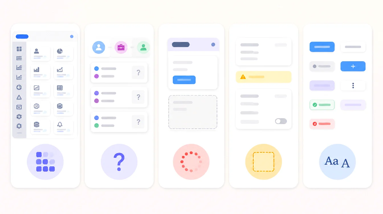
SaaS platforms often become confusing one reasonable request at a time. A setting here, another report there, and soon the navigation resembles a cupboard full of unlabeled drawers.
The common design problems are easy to recognise.
Progressive disclosure helps here. Keep the everyday path visible and bring in advanced controls when they become relevant. Nothing useful needs to be hidden. It simply does not all need to appear on day one.
SaaS applications like Slack, Notion, a collaborative design tool, and HubSpot handle this in different ways. Slack gives conversations a clear structure. Notion uses templates to soften the blank page.
The design tool puts the canvas and collaboration first, while deeper controls wait until the work calls for them. None is perfect. The shared design pattern is useful, though. Let people begin the work before asking them to understand the whole system.
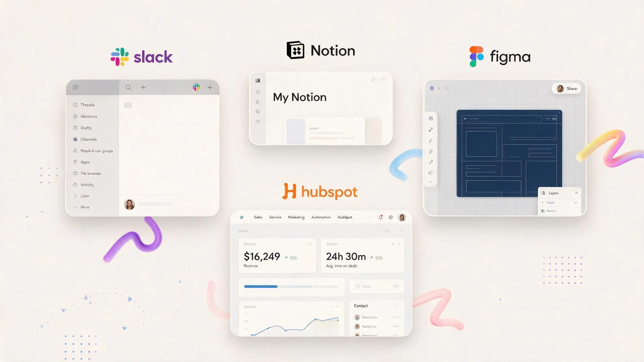
The best SaaS UX examples are not interesting because the cards look nice. They are interesting because a complicated job feels manageable inside them.
Look through 100 SaaS products and the visual styles will change. The useful questions will not. Can users move through the product without losing their place? Can users interact with it without keeping a manual nearby? Does the next step make sense?
Those questions matter more than copying somebody else’s card style. They also shape SaaS UX pricing. One product may need a short audit and a few wireframes. Another may need UX research, a rebuilt structure, new interface patterns, and implementation support. Price the problem, not the screen count. UI and UX design should follow the task, not the layout alone.
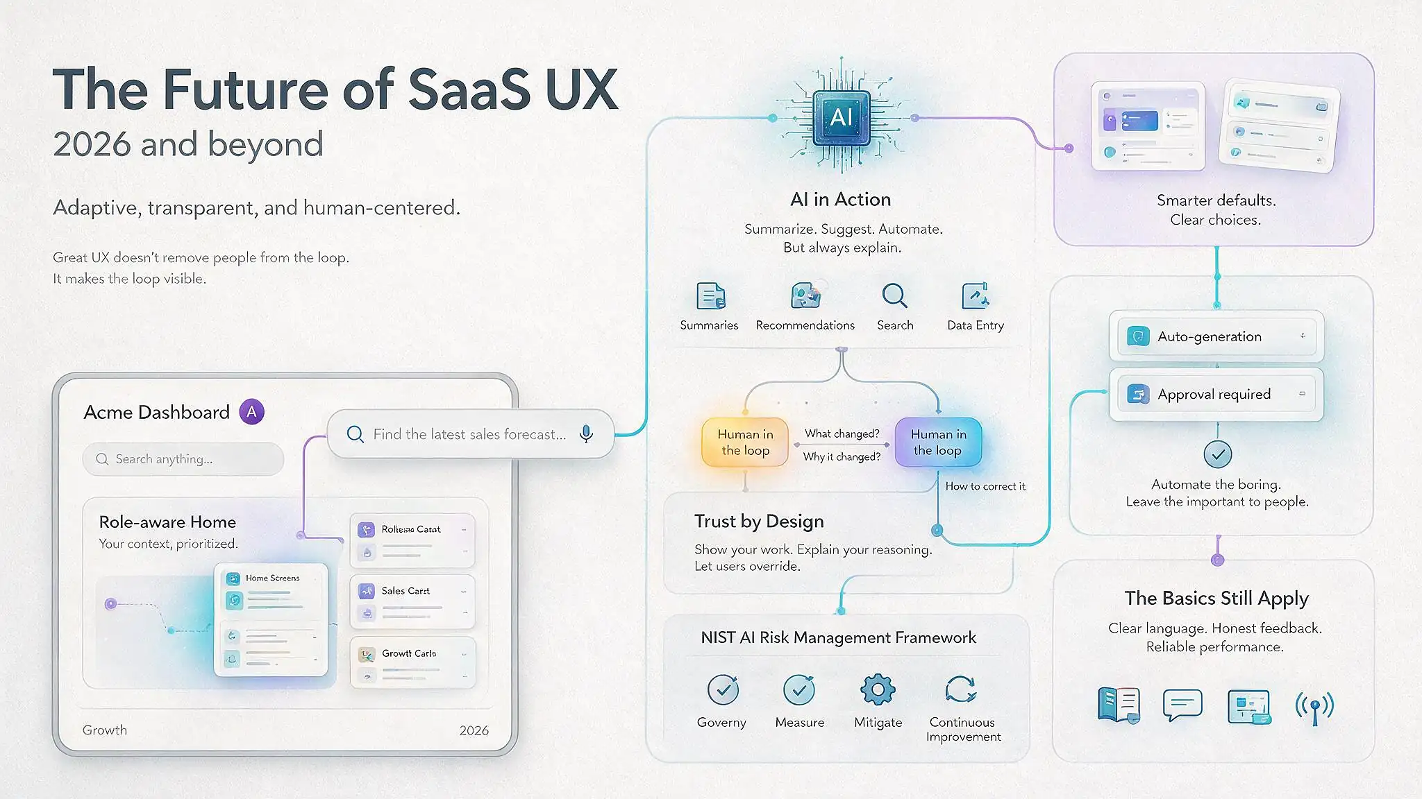
UX design in 2026 is becoming more adaptive. Role-aware home screens, natural-language search, smarter defaults, built-in collaboration, and automation are already changing routine work. The best SaaS product will not automate the most. It will remove the boring parts while leaving people firmly in charge.
AI and machine learning now show up in summaries, recommendations, search, and data entry. That can save time. It can also leave people wondering what just happened.
They need to see what changed, why it changed, and how to correct it. The NIST AI Risk Management Framework makes the same point. Trustworthy systems need to be open about their limits.
For UX design for SaaS, the old basics have not gone anywhere. Clear language, honest feedback, reliable performance, and a smooth user experience still matter.
An automated suggestion that creates more checking has solved nothing. The UX design SaaS teams can trust still begins with people, not the model. Our guide to AI UX design looks at these interactions in more detail.
Good SaaS UI UX takes some weight out of a complicated job. Intuitive UX minimizes user frustration because people make fewer small mistakes and know where to go next.
That does not always call for a dramatic redesign. Start early in the design process, talk to customers, and watch them tackle a real task. Fix the place where they hesitate first. A handful of sensible changes can make the whole product easier to live with.
If you are improving a SaaS product design, start small.
The best design begins with the way SaaS users actually work. That is how teams reach the best product design and continue to design better over time.
If you need a fresh pair of eyes, our product design team can turn the research into a plan you can use.
.svg)


REGISTERED IN Chennai, INDIA.
"Global Team, Building for the world"




.webp)
.svg)
