
Best Webflow Agencies to Build Your Website in 2026
April 27, 2026
6 mins


Image : Source
SaaS (Software as a Service) dashboard design has evolved from being a nice-to-have feature to a vital component of a product’s success. A thoughtfully designed SaaS dashboard is more than a collection of charts and data; it’s the face of your application, the first point of interaction, and the place where users form their initial impressions. A well-crafted design, incorporating best practices in UI (User Interface), can transform a complex SaaS product into an intuitive and indispensable tool. Done right, a dashboard design enhances user experience (UX), drives user engagement, and ultimately improves user retention.
This blog will delve into the importance of effective SaaS dashboard design, explore best practices, and provide insights on how to design a SaaS dashboard along with design trends that make a significant impact. We will also touch upon inspiring SaaS design examples.
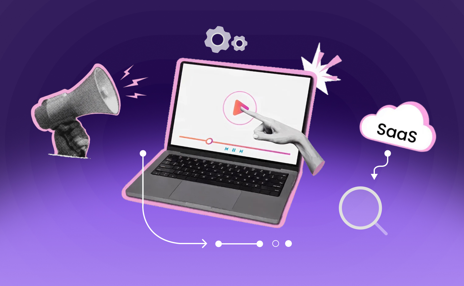
A SaaS dashboard serves as a centralized interface that aggregates data and presents it in a visually appealing manner. It allows users to monitor key performance indicators (KPIs), track progress, and make informed decisions based on real-time data. The effectiveness of a dashboard hinges on its ability to convey complex information clearly and concisely, making dashboard design an essential aspect of any SaaS product.
At the heart of every successful SaaS product lies an intuitive dashboard UI that helps users make sense of their data, monitor performance, and take action. A powerful SaaS dashboard does more than present information - it tells a story, offers insights, and allows users to interact with data in a meaningful way.

Image : Source
User experience is at the heart of effective SaaS dashboard design. A positive UX ensures that users can navigate through the dashboard intuitively, find relevant information quickly, and derive value from their interactions with the software.
UX and UI are often mentioned together, but each plays a unique role in SaaS dashboard design.
A beautifully designed dashboard (UI) that’s hard to navigate (poor UX) won’t perform well. Conversely, a functional but ugly dashboard may also fail to engage users. The goal is a perfect blend of both for a successful SaaS dashboard design. The quality of your UX/UI design in a SaaS dashboard can directly impact how users perceive the value of your product. A clean, efficient, and responsive UX/UI design builds trust and keeps users coming back.

Source: Image

Source: Image
Retention is the holy grail for SaaS companies. Acquiring new users is expensive, but retaining them ensures long-term revenue. A well-designed SaaS dashboard acts as a retention tool by:
Let’s break down why dashboard design is so critical to user satisfaction and how it directly influences retention.
When users log into your application, the dashboard is often their first point of contact. An intuitive and aesthetically pleasing dashboard can create a positive initial impression, setting the tone for the user's experience. A sleek and functional SaaS dashboard design sets a positive tone and signals professionalism.
A well-designed dashboard consolidates key metrics and data points in one place, allowing users to monitor performance, track progress, and make informed decisions without navigating through multiple screens. This centralization enhances efficiency and reduces cognitive load.
Interactive elements such as drill-downs, filters, and customizable widgets empower users to explore data in ways that are most relevant to them. This level of personalization fosters a deeper connection with the application and encourages regular use.
By presenting data that aligns with user goals and providing actionable insights, a well-designed dashboard demonstrates the value of your SaaS product. When users perceive tangible benefits, they are more likely to continue using the service and renew their subscriptions.
Good SaaS dashboard UI helps users feel in control. Features like customizable widgets, smart filters, and user-specific notifications empower users to tailor the interface to their needs.
For SaaS companies, the dashboard isn’t just a UI element, it’s a strategic asset. A well-executed SaaS dashboard design can:

Source: Image
Designing a high-performing SaaS dashboard isn’t just about making it look pretty. It’s about creating a seamless, intuitive experience that helps users derive maximum value. Here are some best practices to guide your design process:
Before you start sketching layouts or picking color schemes, understand what your users are trying to achieve. Are they tracking sales? Monitoring server health? Managing projects? Knowing this helps you create a dashboard design that meets real needs.
Data-rich dashboards often fall into the trap of trying to show everything at once. Instead, follow the UI design principle of clarity. Focus on key metrics, use whitespace effectively, and ensure that the most important information stands out.
No two users are exactly alike. Offering dashboard customization options like choosing data widgets, rearranging layout, or saving filters can significantly boost user satisfaction and perceived value.
Effective SaaS dashboard UI makes smart use of fonts, colors, and layout to guide the eye. Use visual cues like bold numbers, contrast, and spacing to highlight priorities and make navigation intuitive.
Dashboards are data-intensive, which can affect loading times. A laggy dashboard UI leads to user frustration. Ensure your web design is optimized for speed and responsive on different devices.

Source: Image
If you’re wondering how to design a SaaS dashboard, here’s a step-by-step approach:
Conduct surveys, interviews, or usability testing to determine what users expect to see on the dashboard.
Don’t jump straight into high-fidelity mockups. Start with wireframes to map out layout, components, and flow.
Use charts, graphs, and tables that best represent the data. Avoid flashy components that don’t add real value.

Source: Image
Design your SaaS dashboard UI to be inclusive. Use colorblind-friendly palettes, ensure keyboard navigation, and follow accessibility guidelines.
Get feedback early and often. A/B testing, heatmaps, and analytics can show how real users interact with your dashboard UI, helping you refine it.
A value-based approach focuses on delivering actionable insights rather than just displaying raw data points, a critical factor influencing both satisfaction levels among end-users as well as overall retention rates within competitive markets today, where alternatives abound readily available online!
By emphasizing actionable insights derived from collected datasets, such as identifying trends over time, dashboards empower customers not only gain visibility into current states but also make informed decisions moving forward based upon historical patterns observed previously!
These examples highlight how thoughtful design choices contribute significantly to user satisfaction by providing clear insights into critical business metrics.
Staying on top of current UI design trends can help your product look modern and function effectively. Here are some dashboard design trends gaining traction in 2025:

Source: Image
At its core, a great SaaS dashboard isn’t just about clean visuals—it’s about enabling users to achieve their goals effortlessly. When users can immediately extract value from your platform, they’re more likely to stay engaged and loyal.
A well-crafted dashboard boosts retention, reduces friction, and reinforces product value. To create such an impact, businesses need a product design agency that blends user-centric design with strategic thinking.
Alien Design Agency, a leading UX design agency, helps SaaS companies craft intuitive, scalable dashboards that enhance user satisfaction and drive growth.
Get in touch with our product design experts and let’s build something your users will love.
.svg)


REGISTERED IN Chennai, INDIA.
"Global Team, Building for the world"


.webp)