Top SaaS Landing Page Examples and Key Takeaways for Your Business
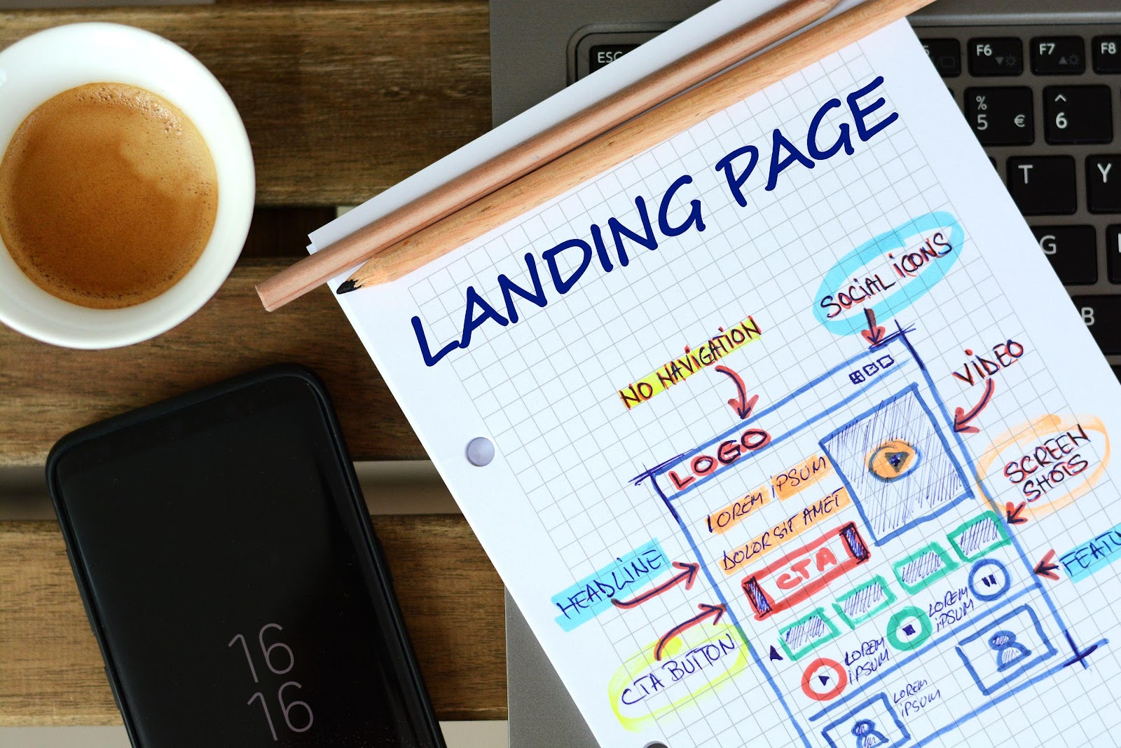
Crafting a high-converting SaaS landing page is paramount for any business looking to acquire new users and drive growth in the competitive software-as-a-service (SaaS) landscape. A great SaaS landing page can make the difference between a visitor bouncing in seconds or becoming a paying customer. In the ultra-competitive SaaS landscape, your landing page isn’t just a welcome mat; it’s your pitch, your demo, and your value proposition all rolled into one. A well-designed landing page acts as a dedicated salesperson, guiding potential customers through a clear value proposition and a compelling call to action.
In this post, we’ll explore some of the top B2B SaaS landing page examples that stand out in design, clarity, and user experience. You’ll also find actionable SaaS landing page best practices and UI insights to help improve your own landing pages.
Why Your SaaS Landing Page is a Make-or-Break Asset
Think about it: every ad click, every organic search result, every referral often funnels down to a single destination, your landing page. Unlike a general website homepage, which serves multiple purposes, a landing page is singularly focused. Its mission? To convert a visitor into a lead or a customer. For SaaS, this typically means signing up for a free trial, requesting a demo, or subscribing to a plan.
A poor landing page can hemorrhage leads, no matter how effective your marketing efforts. Conversely, a well-optimized one can supercharge your conversion rates, ultimately fueling your business growth.
Whether you're in the B2B or B2C space, your landing page is often your first impression. It's where potential users decide if your product is worth their time.
Understanding the Core Elements of a SaaS Landing Page
Before diving into specific examples, let's outline the fundamental components that contribute to a successful high-converting SaaS landing page:
- Compelling Headline: The headline is the first thing visitors see and must immediately grab their attention, clearly stating the primary benefit or solution offered. It should be concise, impactful, and relevant to the target audience's needs.
- Clear Value Proposition: This section elaborates on the headline, explaining what your SaaS does and why it matters to the user. It should highlight unique selling points (USPs) and demonstrate how your software solves a specific problem.
- Benefit-Oriented Copy: Instead of listing features, focus on the benefits users will gain. How will your software make their lives easier, more efficient, or more profitable? Use persuasive language that resonates with your audience.
- Strong Call to Action (CTA): The CTA is the most crucial element, guiding users on what to do next. It should be prominent, action-oriented, and clearly state the desired outcome (e.g., "Start Free Trial," "Request a Demo," "Get Started").
- Social Proof: Testimonials, case studies, client logos, and trust badges build credibility and alleviate potential customer doubts.
- Visuals: High-quality images, videos, or interactive demos can effectively showcase your product and its functionality. Visuals can convey complex information quickly and make the page more engaging.
- Minimalist Design: A clean, uncluttered layout with ample white space improves readability and focuses attention on key elements. Avoid excessive text or distracting elements.
- Mobile Responsiveness: With a significant portion of web traffic coming from mobile devices, ensuring your landing page is fully responsive across all screen sizes is non-negotiable.
- Lead Capture Form (if applicable): If the goal is lead generation, the form should be concise, asking only for essential information to reduce friction.
Top SaaS Landing Page Examples and Key Takeaways
Let's examine some of the top performers in the SaaS space and uncover the strategies that make their landing pages so effective.
1. Slack: Simplicity and Immediate Value Proposition
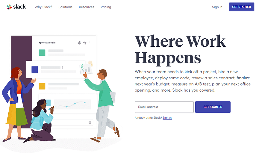
Slack's landing pages are a masterclass in clarity and conciseness. They immediately articulate their core value: "Where work happens."
Key Takeaways:
- Crystal-Clear Headline: Their H1 often gets straight to the point, highlighting the primary benefit without jargon.
- Problem-Solution Approach: They subtly address common communication challenges and present Slack as the elegant solution.
- Visual Reinforcement: High-quality screenshots or short videos demonstrate the SaaS product in action, particularly showcasing their saas dashboard – a clean, intuitive interface that helps users visualize how their team would collaborate.
- Prominent Call to Action (CTA): Buttons like "Try for Free" are strategically placed and stand out.
- Social Proof: They leverage testimonials and logos of well-known companies, building trust and credibility.
2. HubSpot: Comprehensive Value and Educational Approach
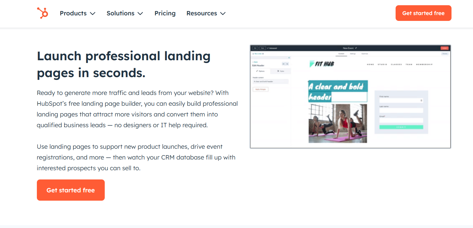
HubSpot's landing pages often cater to various segments of their audience, offering specific solutions for sales, marketing, and service teams. Their approach is often more comprehensive, providing detailed information while maintaining an engaging flow.
Key Takeaways:
- Targeted Messaging: They segment their audience effectively, with each landing page speaking directly to a specific need.
- Feature Highlights with Benefits: Instead of just listing features, they explain the benefit each feature provides to the user. For instance, when showcasing their CRM dashboard design, they emphasize how it allows users to gain quick insights into their sales pipeline, rather than just stating "CRM dashboard available."
- Educational Content Integration: HubSpot often integrates valuable resources like guides or webinars directly on their landing pages, positioning themselves as industry experts and building rapport.
- Clear Tiered Pricing (if applicable): If the landing page is for a specific product, transparent pricing models help users understand the value proposition at different levels.
- Live Chat/Support Options: Providing immediate assistance enhances the user experience and can help overcome objections.
3. Mailchimp: Playful Branding and User-Friendly Design
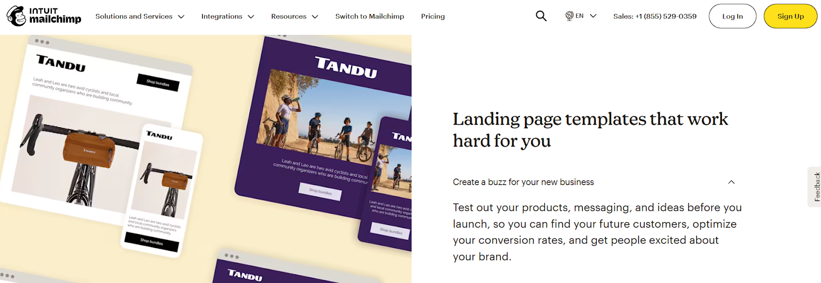
Mailchimp's landing pages are known for their distinctive, friendly, and approachable branding. They make email marketing, which can seem complex, feel accessible and even fun.
Key Takeaways:
- Strong Brand Identity: Their unique illustrations and tone of voice make them instantly recognizable and memorable.
- Focus on Ease of Use: They emphasize how simple their platform is to navigate and use, a critical factor for small businesses and individuals. Their SaaS dashboard design reflects this simplicity, making it easy for anyone to create and manage campaigns.
- Benefit-Oriented Headlines: They often use headlines that highlight the positive outcomes of using their service, like "Send better emails."
- Minimalist Design, Maximum Impact: Despite the playful elements, their web design remains clean and uncluttered, ensuring the core message stands out.
- Interactive Elements: Sometimes they include small interactive elements that enhance engagement without distracting from the main goal.
4. Monday.com: The Master of Clarity and Visual Appeal
Monday.com consistently features as a prime SaaS landing page example, and for good reason.
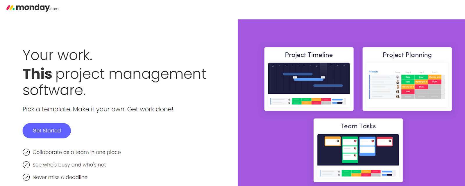
What makes it great: Their landing pages are a masterclass in clean SaaS landing page UI design. They use vibrant colors effectively, but not overwhelmingly, to create a sense of energy and simplicity.
Key Takeaways:
- Visual-first approach: Don't just talk about your product; show it. High-quality, engaging visuals immediately convey value.
- Simple, intuitive UI: The landing page itself mirrors the ease of use of their software. This consistency builds trust.
- Strategic use of color: Color can highlight key elements and evoke emotion without being distracting.
5. Dropbox: Minimalist Design, Maximum Impact
Dropbox Business is a solid example of a clean, corporate-style B2B SaaS landing page that focuses on simplicity and trust.
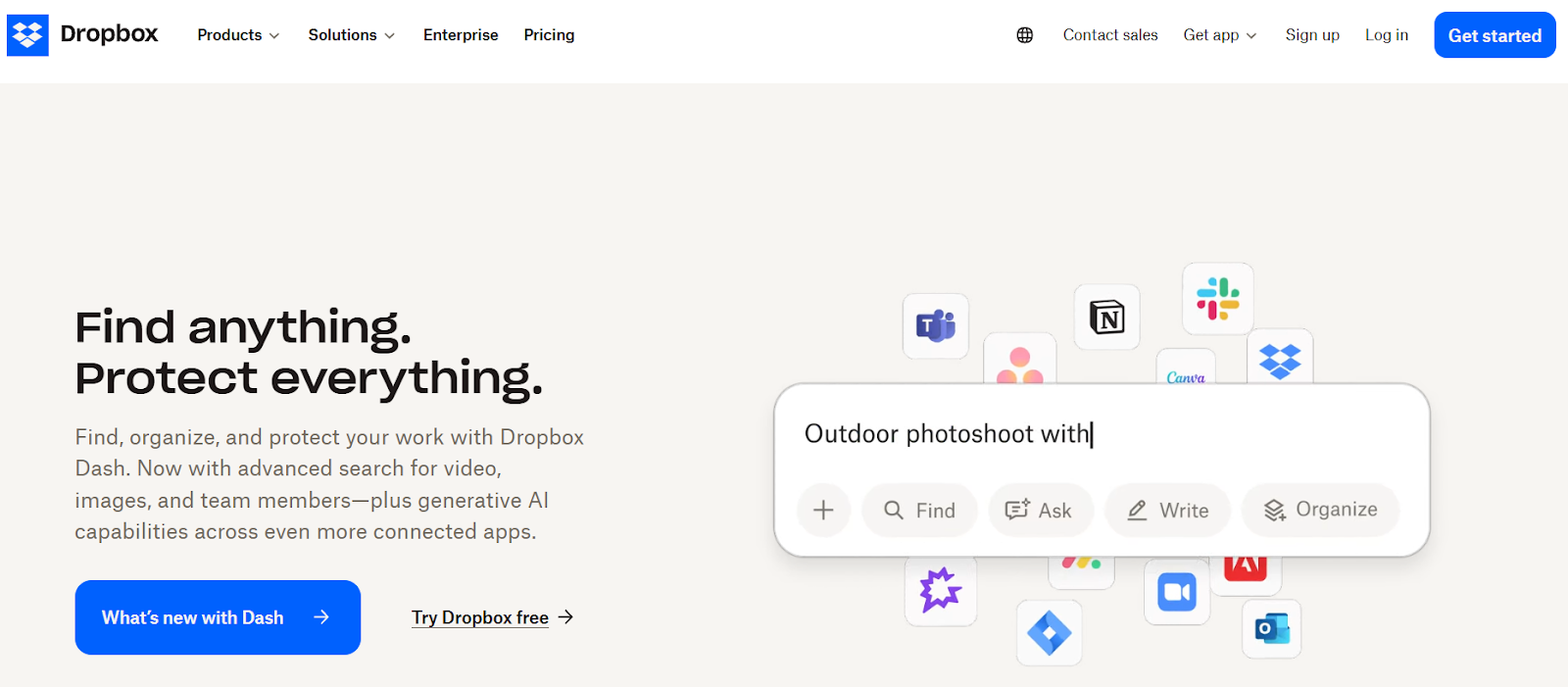
What makes it great is that they keep the layout uncluttered, relying on a strong value proposition and minimal text to convert.
Key Takeaways:
- Less is often more: Don't feel the need to cram every detail onto the page. Focus on the essentials.
- Strong, memorable value proposition: A clear, concise statement of what you offer.
- Strategic information delivery: Offer more details in accessible, non-intrusive ways (e.g., FAQs, collapsible sections).
SaaS Landing Page Best Practices: A Checklist for Success
Beyond individual examples, here's a concise checklist of SaaS landing page best practices to keep in mind:
- Single-minded focus: Each landing page should have one primary goal and one primary CTA.
- Ad-to-page relevance: Ensure the content and messaging of your landing page perfectly match the ad or link that brought the visitor there. This is crucial for paid campaigns.
- Above the fold impact: Your most critical information (headline, subheadline, hero image, and primary CTA) should be immediately visible without scrolling.
- Optimized lead capture forms: Only ask for essential information. Longer forms can deter conversions, though for B2B demos, more fields might be acceptable to qualify leads.
- Page speed: Slow loading times kill conversions. Optimize images, scripts, and overall page performance.
- A/B testing: Never assume. Continuously test different headlines, visuals, CTA copy, and layouts to identify what resonates best with your audience.
- Responsive design: Your page must look and perform flawlessly on desktops, tablets, and mobile phones.
- Privacy policy link: Especially important for B2B SaaS, a clear link to your privacy policy builds trust.
- Post-conversion experience: What happens after a user converts? A clear thank-you message or seamless onboarding process is crucial for a positive user journey.
The Art of SaaS Landing Page UI Design
SaaS landing page UI design isn't just about aesthetics; it's about guiding the user effortlessly towards conversion.
- Whitespace: Don't be afraid of empty space. It helps reduce clutter and makes key elements stand out.
- Visual flow: Use visual cues (arrows, implied lines, contrasting colors) to direct the visitor's eye through the content, from the headline to the CTA.
- Button design: Your CTA button should be visually prominent, use a contrasting color, and have compelling, actionable text.
- Consistency: The design elements (colors, fonts, imagery) should be consistent with your brand identity and your overall website.
- Readability: Choose legible fonts and ensure sufficient contrast between text and background. Break up large blocks of text.
- Authentic product visuals: Avoid generic stock photos. Showcase your actual software interface so users know what to expect.
Final Thoughts: Building Your Best SaaS Landing Page
Creating the perfect SaaS landing page means balancing great design, messaging, and conversion-focused structure. Whether you're offering a demo, free trial, or downloadable content, your landing page should immediately address the visitor's pain points and present a clear solution.
Subscribe for Industry insights
Get cutting-edge design insights + Free pro
resources just for subscribing!
FAQ
More Insights


Nagar, Vanagaram, Chennai, Tamil
Nadu 600095, India
REGISTERED IN Chennai, INDIA.
"Global Team, Building for the world"




.webp)
.svg)