
Best Webflow Agencies to Build Your Website in 2026
April 27, 2026
6 mins


In the blink of an eye, a user decides if they like a mobile app or website. That decision hinges almost entirely on one core element: mobile navigation. As the number of users accessing websites and mobile apps through mobile devices continues to rise, businesses must prioritize mobile navigation best practices to ensure seamless user journeys. Poor navigation can lead to frustration, increased bounce rates, and abandoned sessions.
Designing mobile navigation best practices isn't just about placing a menu; it’s about crafting a seamless, intuitive conversation between the user and the digital product.
This guide explores everything you need to know about mobile navigation design, including mobile app navigation best practices, UI tips, common navigation patterns, and real-world mobile navigation examples. Whether you're redesigning an app, creating a mobile website, or optimizing a digital product, this is your complete guide to smarter, smoother, stress-free navigation.
When users interact with a mobile app or mobile website, they rely entirely on the navigation menu, navigation bar, and supporting UI elements to understand where they are, where they can go, and how to get there. On a desktop, users have more screen real estate, visible menus, and multiple navigation options. But on a mobile device, the challenge is much bigger: limited space, smaller touch areas, and a need for simplicity.

Image: Source
From a UX perspective, mobile navigation is not just about layout - it shapes how users perceive the brand, the flow, and the usability of the entire product. If navigation feels confusing or cluttered, users quickly lose trust.
This is why understanding navigation patterns, design patterns, and mobile app navigation best practices is fundamental to delivering exceptional mobile UX.
To design effective experiences, it’s essential to follow proven mobile navigation best practices that support both UX and UI. These recommendations serve as the foundation of a usable and intuitive mobile interface.
The simplicity of your navigation design significantly impacts usability. Overloading a mobile navigation menu with too many options creates cognitive friction. Aim for a clear, minimal set of navigation choices based on user behavior and priorities.
Best practices include:
A simplified menu enhances clarity and speeds up decision-making.
Users are accustomed to specific navigation patterns, such as:
Pattern
Description
Example Use Cases
Bottom Navigation Bar
Persistent, thumb-accessible bar with 3–5 main destinations
Social media (Instagram, TikTok)
Retail apps (Amazon)
Banking apps
Tab Bar
Horizontal row of clickable icons or labels for quick section switching
Music streaming, calendars
Hamburger Menu
Collapsible menu icon (three horizontal lines) reveals site or app sections
Content-rich news apps
Settings
Account details
Help pages
Legal information
Floating Navigation Button
Single round button for a primary action, floats above UI
To-do, note-taking apps
Swipe-based Navigation
Side panel or slide-over menu for complex hierarchies
Ecommerce, large platforms

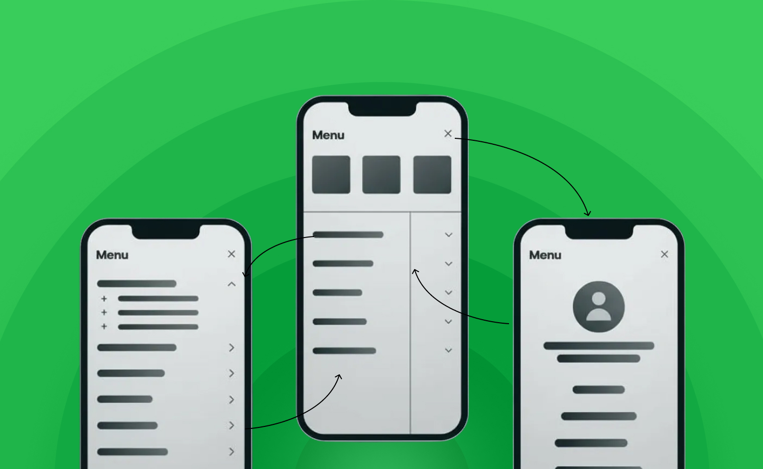
Hamburger Menu: Source
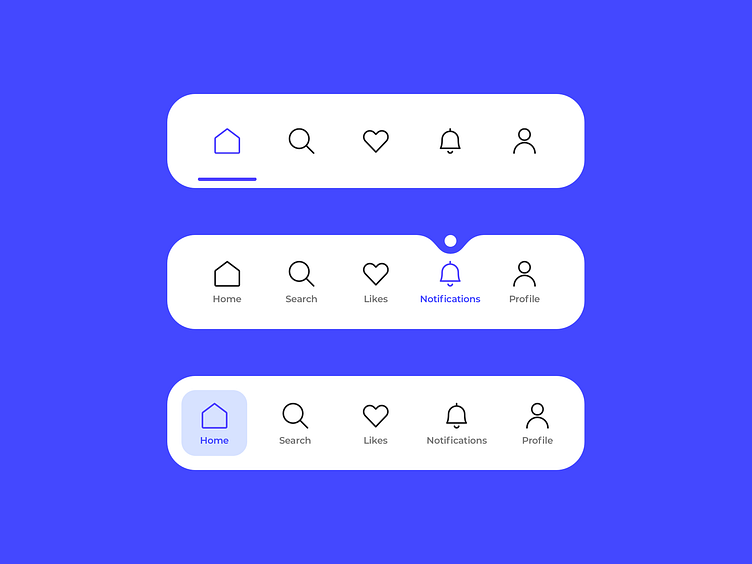
Tab Bar: Source
Choosing established design patterns ensures your users instantly understand how to interact with your interface.
On a mobile device, accessibility is directly tied to ergonomics. The area reachable by the user’s thumb should guide where you place your navigation menu, menu options, and key CTAs.
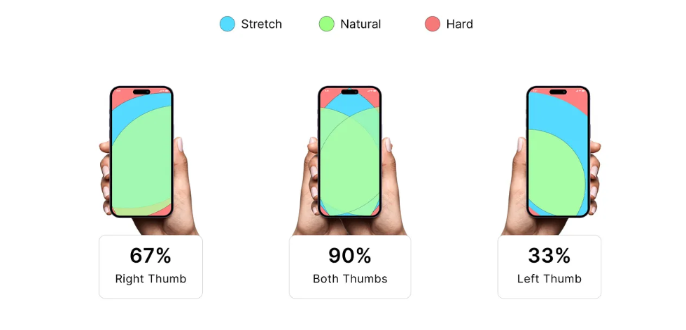
Image: Source
Placing important navigation elements in the thumb zone is one of the simplest but most impactful mobile navigation best practices.
Consistency is crucial in mobile navigation design. A stable, predictable layout helps users build muscle memory. Whether your app includes a bottom tab bar, a top navigation bar, or a slide-out menu, all screens should behave consistently.
Designing mobile navigation is part art, part science. The structure, visual design, and behavior all contribute to how users perceive and interact with your mobile product. Below is a strategic framework to guide your decisions.
Before designing the UI, map out your content hierarchy using a user-first approach:
This strategic planning is essential when applying mobile app navigation best practices.
Users should be able to instantly identify primary versus secondary navigation elements.
Emphasize priority using:
High-contrast icons in a bottom navigation bar improve scannability and accessibility.
Icons alone can create confusion. Supporting them with text labels ensures clarity. The best mobile navigation examples almost always include both icons and labels for improved UX.
While mobile app navigation focuses on long-term engagement, mobile websites often serve for quick information access or transactional needs. The mobile website navigation best practices below help ensure a smooth browsing experience.
A common mistake is hiding the navigation menu too deeply. Keep menu access visible on every page, typically in one of these placements:
Sticky navigation is a powerful navigation pattern that ensures users can quickly return home, access their cart, or navigate to other areas without scrolling.
Mega menus don’t work well on a mobile device due to small screens and tap-target limitations. Instead, use collapsible lists with clear categories.
Sometimes the best way to understand mobile navigation design is through real-world mobile navigation examples.
Image : Source
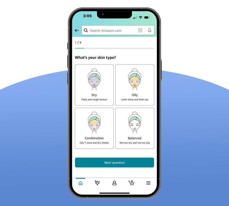
Image: Source
Spotify blends multiple navigation patterns:
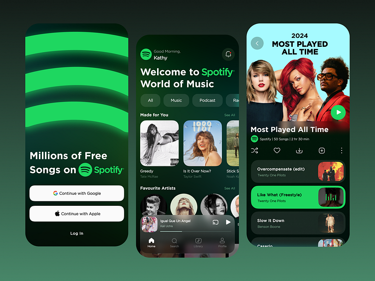
Image: Source
It’s one of the strongest mobile app navigation examples in the industry.
Designing smooth, intuitive mobile experiences requires a deep understanding of users, devices, and proven navigation patterns. The best mobile navigation design is clear, minimal, and user-first, ensuring that every interaction feels effortless.
By applying these mobile navigation best practices, you’ll create mobile apps and websites that guide users naturally, reduce frustration, and support higher engagement. And what matters most is designing for clarity, consistency, and real-world usability.
Whether you rely on a bottom navigation bar, a hamburger menu, or an innovative navigation pattern, what matters most is designing for clarity, consistency, and real-world usability.
A well-crafted navigation system becomes the invisible backbone of the entire user experience and when done right, users barely notice it at all.
If you’re looking to elevate your product with world-class mobile navigation, intuitive UX, and pixel-perfect UI, Alien Design Studio can help you build experiences your users will love. Their team specializes in creating high-performing digital products powered by smart interaction design and modern navigation patterns. To explore their work or discuss your next project, simply Contact Us and take the first step toward crafting exceptional mobile experiences.
.svg)


REGISTERED IN Chennai, INDIA.
"Global Team, Building for the world"


.webp)
.svg)